TURNING MOCKUPS INTO CODE
TIME LIMIT: 5 HOURS
In this chapter, we will pick up the Alice’s Restaurant project where the Project: Structure Your Content With HTML First chapter left off. In that chapter, we set up our project’s file structure and familiarized ourselves with the sorts of HTML tags the Alice’s Restaurant project would likely require.
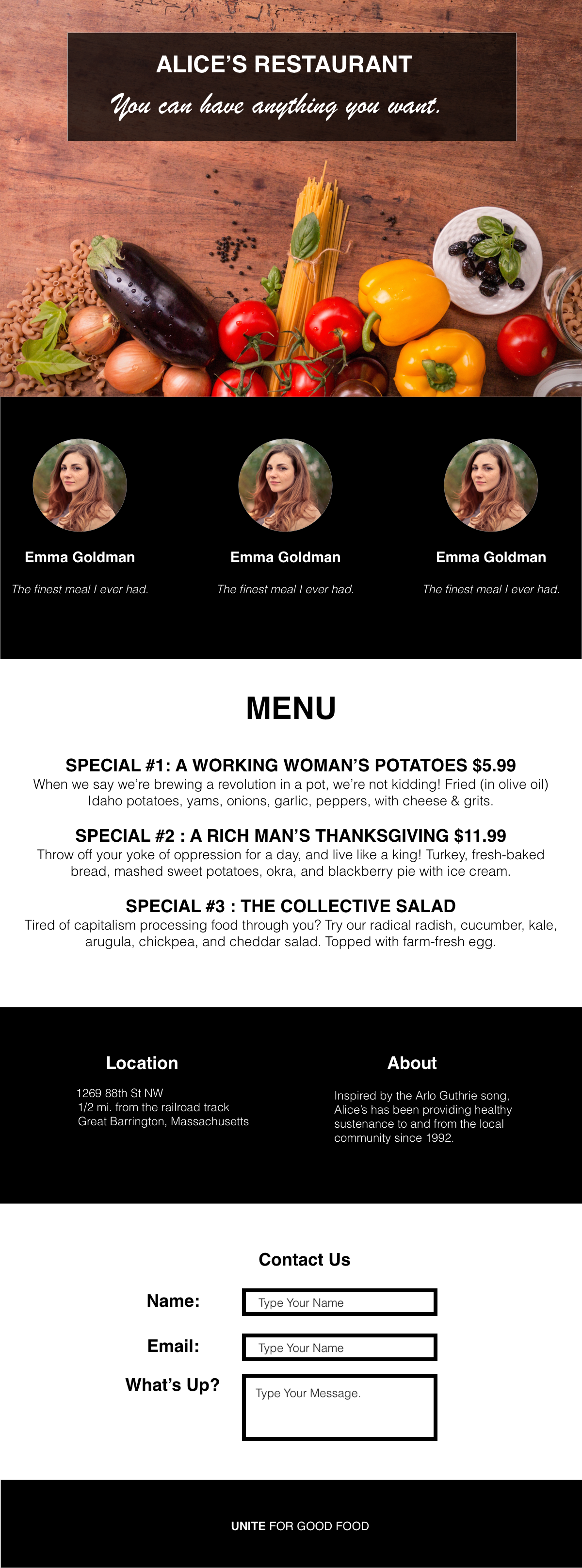
We will now use a mockup that tells us what the Alice’s Restaurant page is supposed to look like. We will restructure/rewrite our HTML to conform to the mockup, then style the resulting HTML elements with CSS.
Enter The Designer
Meet The Designer. The Designer is an important person in the life of a front-end engineer – they are the ones designing the webpages you have to build (user interface or UI). They are the ones who are telling you what the user is supposed to experience (user experience or UX). You want to have a good working relationship with The Designer.
Designers are artists, and they are a rarer breed than front-end engineers. Most designers have worked with a number of front-end developers and have a very good feel for the process. Early in your career, they will be waiting for you to prove yourself. You do not want The Designer to believe you are botching their creations. Pay attention to them when they talk.
OK, now fast-forward to the business of Alice’s Restaurant. It’s 10AM. The Designer has just walked into your office.
The Designer: Hey there, I’m The Designer. The Boss and Engineering Manager told me you’re going to be skinning out the homepage on the Alice’s Restaurant project.
You: Yes, hi, I am The Coder. I will turn your mockups to HTML and CSS. Want to show them to me, make sure we’re on the same web… page?
The Designer: Heck yeah. OK, here’s the first version. I’ve put dummy data in here for some of it, since we don’t have the actual customer pictures yet.

You: Gorgeous.
The Designer: Thanks! It’s a little brutalist for me, but the people at Alice’s Restaurant wanted this style.
You: It looks like it’s basically 6 panels? A splash image for the landing in the first panel, then alternating black and white backgrounds for the next 5?
The Designer: That’s right. The page is using just plain black and white - CSS hex codes #000000 for black, since black is the absence of color, and pure white FFFFFF, since white reflects all color. Like I said, very brutalist.
You: Oh, you know CSS?
The Designer: Well, that’s just basic color theory, but yeah, I know a fair amount of CSS. As a user experience designer for the web, I am constrained by what CSS can do.
You: Yes. Of course.
You: OK, so for the first panel, you have a splash background image take up, what, 90% of the height of the landing screen?
The Designer: 90, 95. Whatever looks good.
You: OK, let’s look at the “Alice’s Restaurant” box in that first panel. What’s the transparency on that black background? What fonts are those?
The Designer: 75%. The title is regular, old Helvetica. The slogan line is Brush Script MT.
The rest of the page is Helvetica.
You: Got it. Let’s move on to the second panel. This looks like a standard set of testimonials. 3 of them.
The Designer: Yes. Have them break onto their own separate lines whenever the screen width is less than 768 pixels. Pretty standard.
You: Got it. Looking at the third and fourth panels… this looks like pretty standard text formatting.
The Designer: That’s correct. In the fourth panel, have the Location and About sections break onto their own separate lines whenever the browser width is less than 768 pixels, again. You know. Standard responsive web design.
You: Got it. Moving onto the fifth panel - the Contact Us one. What should I do with the data on submit?
The Designer: Don’t worry about it, the JavaScript developer will just take these skinned-out webpages from you and add the JavaScript. This is why we use git, after all.
You: Got it, cool. Anyways, I should be able to get this done pretty quickly. I’ve already set up a GitHub Page deployment for simple demos of this project. You can see them at https:///<YOUR-GITHUB-USERNAME.github.io/alices-restaurant.
The Developer shows mild surprise, composes themself, and leaves, vintage sneaks softly swishing on the floor.
Making A Plan
You now have all of the information you need to code the HTML and CSS for this mockup. As always, let’s start by making a plan. Engineering without a plan is guaranteeing that time will be wasted.
We have enough nitty gritty details (fonts, transparency numbers, etc). These details will all come out in the styles.css stylesheet. But before these come out, we need to figure out how to restructure and edit index.html. We need to reformat our HTML (and add and delete some new elements). We want to write our HTML in such a way that writing our CSS is easy. How do we do that?
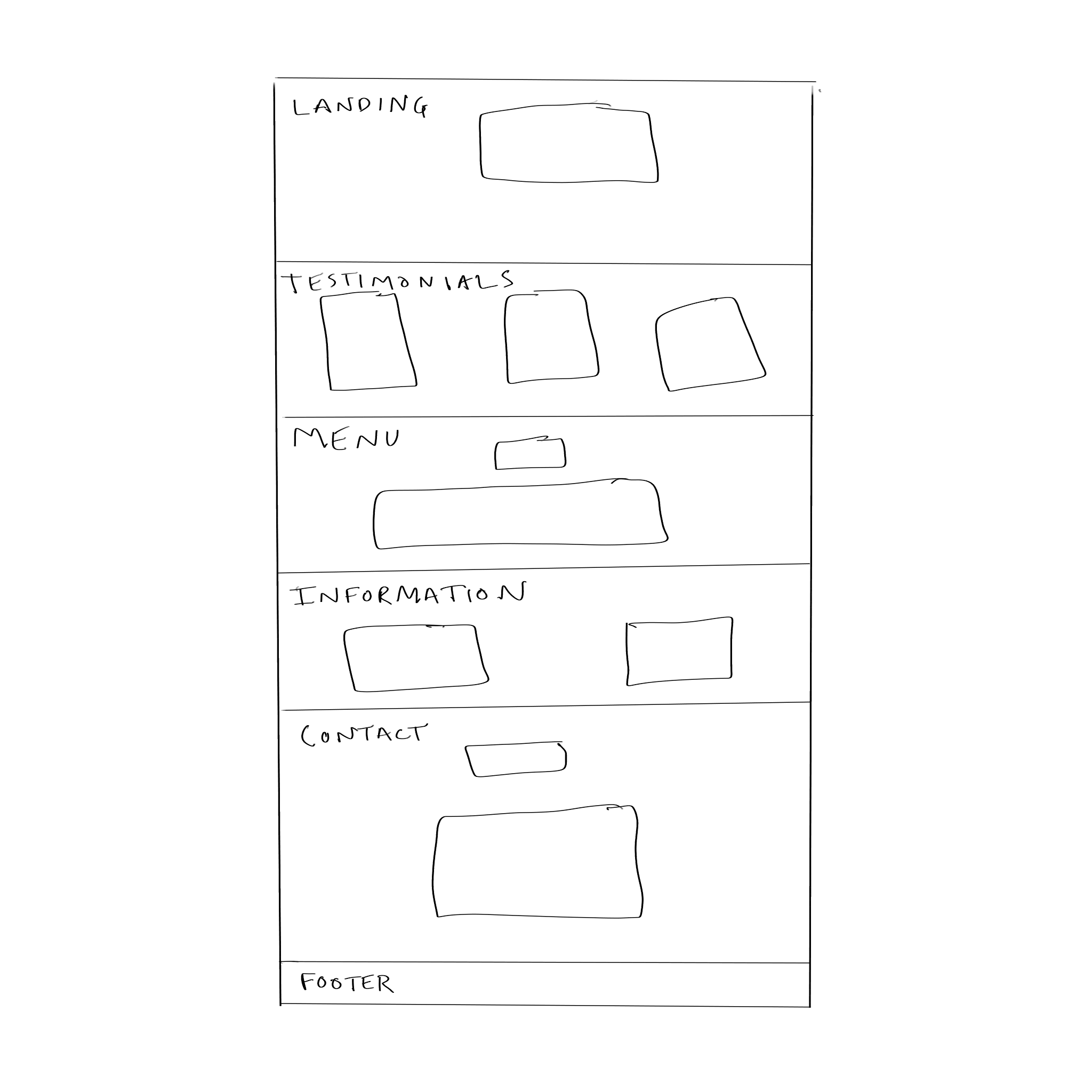
When turning a mockup into HTML, you generally want to take a top-down approach. Ask yourself: How is the overall page structured? What are the biggest boxes of content? Then what boxes of content are inside those bigger boxes? As a friend once said to me, “Layout first, then second, then third. Then do all the little things.” We will talk more about layouts in a few chapters. For now, I invite you start by drawing the “6 panels” The Designer and The Code discussed. Then see which boxes belong in those?
My box diagram looks like this:

Let’s turn these boxes into HTML, then use CSS to style them.
Don’t Forget About Version Control
Since we are now on a team, we need to use proper Git hygiene. Since we are still the only people working on this project, we will stick with the master branch. As soon as someone else begins coding on the project, we need to start using feature branches.
But for now, let’s ensure we are 1) on the master branch, and 2) we have all of our work saved. In the even that something goes wrong, we can revert the codebase to a previous commit (which you can easily figure out how to do with Google).
From the command line:
cd ~/Desktop/alices-restaurant
git status
If there is unsaved work, add and commit the files. Once your git status is clean, proceed.
Revamp That <head> and <body>
We have already set up an index.html page that is linked to the styles.css sheet. We can thus leave the HEAD of the HTML page alone, with the exception of one thing: Let’s get rid of those pesky browser presets. We can do this by importing a software library called Normalize, which gets rid of most browser presets. Do this by inserting the following link tag inside the head of your index.html page, directly above the already-existing link tag.
<link rel="stylesheet" href="https://cdnjs.cloudflare.com/ajax/libs/normalize/8.0.0/normalize.css">
That’s it for the HEAD element. Now turn all of those boxes you diagrammed above into HTML by replacing the existing BODY with the following code:
<body>

    <div class="Landing">
        <div class="Sign">
            <h1>alice's restaurant</h1>
            <p>You can have anything you want.</p>
        </div>

    </div>

    <div class="Testimonials">

        <div class="Testimonial">
            <img src="images/woman.png">
            <p class="name">Emma Goldman</p>
            <p class="review">The finest meal I ever had.</p>
        </div>

        <div class="Testimonial">
            <img src="images/woman.png">
            <p class="name">Emma Goldman</p>
            <p class="review">The finest meal I ever had.</p>
        </div>

        <div class="Testimonial">
            <img src="images/woman.png">
            <p class="name">Emma Goldman</p>
            <p class="review">The finest meal I ever had.</p>
        </div>

    </div>

    <div class="Menu">
        <h2>menu</h2>
        <ol>
            <li>
                <h3>SPECIAL #1: A WORKING WOMAN'S POTATES</h3>
                <p> When we say we’re brewing a revolution in a pot, we’re not kidding! Fried (in olive oil) Idaho potatoes, yams, onions, garlic, peppers, with cheese & grits.</p>
            </li>
            <li>
                <h3>SPECIAL #2: A RICH MAN'S THANKGIVING</h3>
                <p>Throw off your yoke of oppression for a day, and live like a king! Turkey, fresh-baked bread, mashed sweet potatoes, okra, and blackberry pie with ice cream.</p>
            </li>
            <li>
                <h3>SPECIAL #3: THE COLLECTIVE SALAD</h3>
                <p>Tired of capitalism processing food through you? Try our radical radish, cucumber, kale, arugula, chickpea, and cheddar salad. Topped with farm-fresh egg.</p>
            </li>
        </ol>
    </div>

    <div class="Information">
        <div class="Location">
            <h3>Location</h3>
            <address>
                1269 88th St NW
                    1/2 mi. from the railroad track
                          Great Barrington, Massachusetts
            </address>
        </div>
        <div class="About">
            <h3>About</h3>
            <p>
                Inspired by the Arlo Guthrie song, Alice’s has been providing healthy sustenance to and from the local community since 1992.
            </p>

        </div>

        <
    </div>

    <div class="Contact">
        <form action="/my-handling-form-page" method="post">

            <div>
                <label for="name">Name:</label>
                <input type="text" id="name" name="user_name" placeholder="Type Your Name">
            </div>

            <div>
                <label for="mail">Email:</label>
                <input type="email" id="mail" name="user_mail" placeholder="Type Your Email">
            </div>

            <div>
                <label for="msg">What's up?</label>
                <input type="text" id="msg" name="user_message" placeholder="Type Your Message"></textarea>
          </div>
        </form>
    </div>

    <footer class="Footer">
        <p><strong>unite</strong> for good food</p>
    </footer>

</body>
Don’t forget to save your work with git here.
What did we just do?
We took those six top-level panels we diagrammed above and turned them into five DIVs and one FOOTER. Inside of each of those six panels, we further boxed up their content into further HTML elements. This content is logically ordered, properly marked up, and now ready to be styled. We gave each of the six top-level boxes class attributes, which we will use as selectors in our stylesheet.
Styling the Boxes To Look Like The Mockup
Open up your styles.css file. Delete everything in it, and write the following code into it.
I recommend that you continously examine your work in the browser as you write the following stylesheet, as it will make clearer what certain CSS properties do.
/*
* Some generalized styling for the page
*/

body {
	text-align: center;
	font-family: Helvetica;
}

.Menu,
.Contact {
	background: rgb(255, 255, 255);
	color: rgb(0, 0, 0);
}

.Testimonials,
.Information,
.Footer {
	background-color: rgb(0, 0, 0);
	color: rgb(255, 255, 255);
}

/*
* Style each panel and its elements from top to bottom.
*/

.Landing {
	height: 90vh;
	background-image: url(images/table-food.png);
	background-size: cover;
	overflow: auto;
}

.Landing .Sign {
	width: 70%;
	margin: 0 auto;
	margin-top: 5em;
	background-color: rgba(0, 0, 0, .75);
	color: rgb(255, 255, 255);
	padding: 1em;
	position: relative;
}

.Landing h1 {
	text-transform: uppercase;
	font-size: 3em;
}

.Landing p {
	font-family: "Brush Script MT";
	font-size: 3em;
}


.Testimonials div {
	width: 30%;
	display: inline-block;
}

.Testimonials img {
	width: 100%;
	border-radius: 100%;
	width: 40%;
}

.Testimonial {
	margin: 2em 0;
}

.Testimonial .name {
	font-weight: bold;
}

.Testimonial .review {
	font-style: italic;
}

.Menu h2 {
	text-transform: uppercase
}

.Menu ol {
	list-style-type: none;
	width: 80%;
	margin: 0 auto;
}

.Information > div {
	width: 30%;
	display: inline-block;
}

.Contact {
	padding: 3em;
	text-align: initial;
}

.Contact input,
.Contact textarea {
	border: 3px solid black;
	margin: .5em;
}

.Contact div {
	margin: 0 auto;
	width: 40%;
}


footer {
	padding: 1em;
	font-size: 2em;
	text-transform: uppercase;
}


label {
    width:180px;
    text-align:right;
    padding-right:10px;
}
Don’t forget to save your work with git.
What Did We Just Do?
We just used CSS to make a webpage that looks pretty similar to the mockup The Designer gave us.
We used CSS comments to mark where we made generalized styles for the pages and where we made panel-specific styles. The generalized styles are helpful because if a color scheme gets changed, we only have to change the colors in a few places instead of tracking them down all over the page.
We made use of various kinds of selectors, including multiple selectors and descendant selectors.
Deploy Your Work
Make sure you have your page looking how you want it, then save your work with git. Since we did all of our work on the master branch, let’s merge it into the gh-pages branch, which we can then push to GitHub, to trigger a GitHub Pages rebuild.
git checkout gh-pages
git merge master
git push origin gh-pages
Recap
You just built a page that looks better than many other restaurant pages in existence. Your understanding of essential web technologies is already sufficient to do basic web work.
EXERCISES
-
Salvador Dali, a famous painter, once said “Have no fear of perfection—you’ll never reach it.” What did he mean by this? How can we apply this lesson to our own work? Reflect upon the fact that our webpage doesn’t look exactly like the mockup. Think about how many different ways a webpage can be viewed.
-
The difference between our styled and unstyled page was extreme. Did you see what a difference the fonts made? Design matters in communication. As a front-end developer, you need to know enough about design to communiate effectively with a developer. You will often have to make some judgment calls yourself when coding.
Skim Wikipedia on Graphic Design: https://en.wikipedia.org/wiki/Graphic_design
-
Most websites have some sort of FORM element on them. Read about the form and input elements on Mozilla: https://developer.mozilla.org/en-US/docs/Learn/HTML/Forms/Your_first_HTML_form
-
Write down the name of every CSS property we used.
Look them all up in the CSS book, and read a little bit about what they do.
Write a one-sentence description of what each property does in your Coding Journal.
-
Why did we declare the
font-familyproperty within thebodydeclaration block (the first rule block instyles.css)? Read Chapter 4 of the CSS book - “Saving Time With Style Inheritance”. -
What is CSS inheritance?
-
Do you see the declaration block for
.Landing? What happens if you remove theoverflow: autodeclaration?
