The Big Picture - Layout, Grid Systems, and Responsive Web Design
TIME LIMIT: 4 HOURS
As we have seen, front-end web development is necessarily heavily influenced by and intermingled with the field of graphic design. This brief chapter touches on three big design concepts. Familiarity with these provides helpful mental models for breaking down front-end development problems.
TIME LIMIT: 4 HOURS
Layouts: A Top-Down Visual Analysis of Webpages
“Page layout” is the generalized graphic design term for how visual components of pages (including WEBpages) are arranged and organized. Discussions of page layout can rapidly become complex, weaving in issues of communication, psychology, and culture. At the end of the day, though, a layout is just how the different components of a page are positioned.
As we have demonstrated and discussed already, layout is where a front-end developer should always begin breaking down a mockup. When we separate components of a page into different boxes, or containers, we are figuring out the layout design of the page, and then building to that. There is a reason for this - how you lay out your content is the most important aspect of any visual design. Your users aren’t going to care nearly as much about the minute details of of a webpage (e.g. letter-spacing) as they are about seeing the content laid out in a visually pleasing and logical manner that helps them fulfill the reason they are visiting your webpage.

Grid Systems: What you get when layout designers use graph paper.
Grid systems are an effort to make designing and building layouts easier. Grid systems exist to make it easier to describe where and what sizes boxes of content should be in relation to each other and the webpage as a whole. Three basic, nestable units constitute the descriptive language of grid systems: Containers, rows, and columns. Containers hold everything together at the top - they contain rows, which are the horizontal units of the page. Rows stack on top of each other. Inside of rows are div elements (boxes!), which are said to be 1 (or more) columns wide.
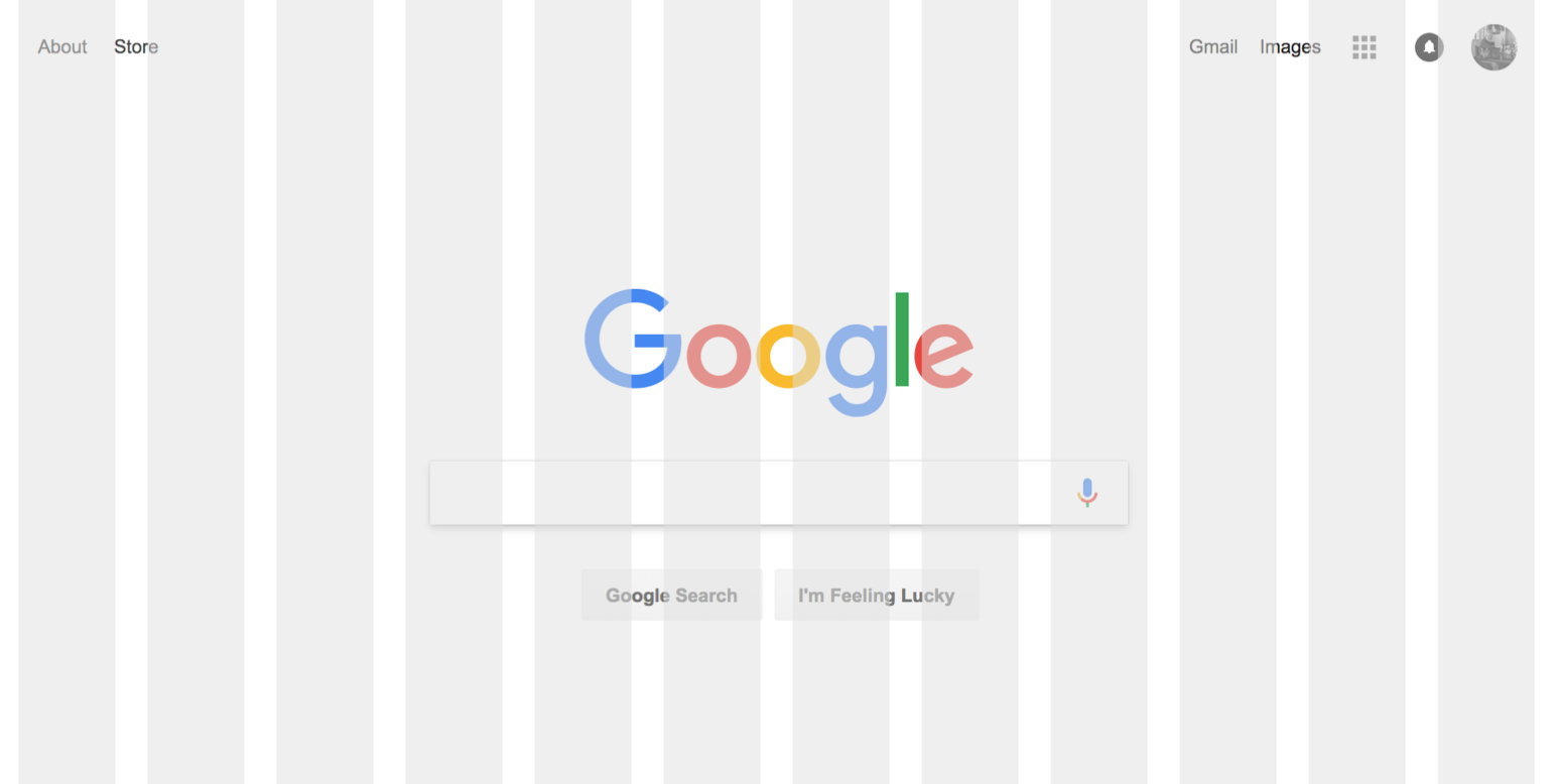
Graphic designers will often describe a page of content as being “12 columns wide”. These columns have no standard width. The designer just means that they have taken the page and split it up into 12 equally wide columns. The designer of the Google homepage could have very well presented a mockup in a conversation like this?
So you’ll see we’re using a standard 12 column grid. The content is split across four rows. The navigational bar is the entire top row - the navbar row is 12 columns wide, with the two separate groups of links attached to each end. The group of links on the left is two columns and the group on the right is three.
The second row contains the logo, which is about four columns wide.
The third row contains the search bar. Make the search bar six columns wide.
The four row are the buttons; they’re also four columns wide.
Pad the content inside the columns as the mockup shows.

Can you see it?

It’s not a big deal if this isn’t perfectly clear. Experience and experimentation will make it seem simple to you soon enough.
iPhone or Giant Desktop Monitor? Responsive Web Design
People view websites in a ridiculously different number of devices. Some people are using Firefox on an Android phone. Other people are using Internet Explorer on a giant monitor. Others are using Safari on an iPad. Putting aside the differences between browsers, we are still confronted with the fact that viewports (browser windows) can range from just a few hundred pixels wide to thousands of pixels wide. A design that looks good on a big desktop is probably excruciating to use on mobile. People don’t like excruciating user experiences.
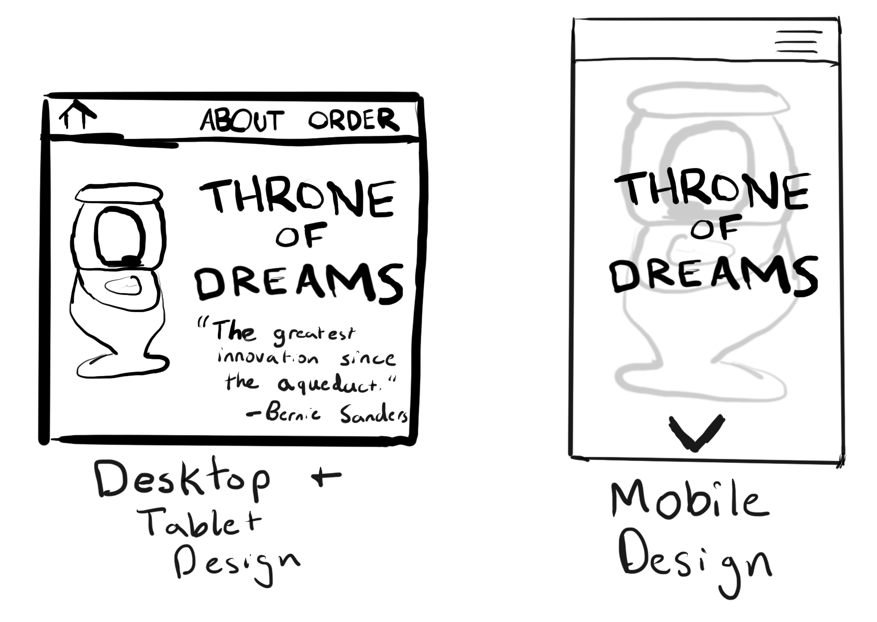
The solution: Use different designs for different screen sizes. This general approach is referred to as “Responsive Web Design”. From a programmatic standpoint, it’s pretty simple: 1) Determine the width of the viewport, 2) Serve the appropriate set of CSS rules you’ve created for that viewport.
CSS makes the process of serving different rules for different viewport sizes pretty easy.

Trial and Error
There is no silver bullet for layout design. You will get better at it with practice, but there will always be a certain amount of trial and error to the process. Even once a front-end developer makes everything look great on their machine, quality assurance will often send a design back saying, “The profile page at /me doesn’t work well on Chrome in Android.” Such quality assurance is an accepted part of the process (which is why people are employed to do it as a full-time job).
Exercises
- Read/skim Chapter 12 of the CSS book - “Introducing CSS Layout”.
-
What does “div” stand for?
-
What are 5 of the recommended layout strategies?
- Read/skim Chapter 15 of the CSS book - “Responsive Web Design”.
-
What is responsive web design?
-
What is a media query?
-
What does “mobile first” mean?
- Read/skim Chapter 16 of the CSS book - “Using A CSS Grid Sytem”.
-
What are containers?
-
What are rows?
-
What are columns?
- Go visit Meetup.com. Look at the following pages: Your profile, the homepage, and a group page. Using your coding notebook, sketch out the containers, rows, and columns, for each page.
