Flex Your Responsive Webpage Skills
We are now going to build a responsive webpage – it will apply different CSS styles depending on viewport width.
The Assignment
The Engineering Manager and The Designer are back.
The Designer: WASSUP WASSUP.
Engineering Manager: Jeez, the projects are just flooding in! We’ve got a new gig working on the site of a local weekly newspaper. They’re called The Ocala Newsletter, and they want a webpage that looks good on Desktop and Mobile.
You: Cool. I know how to implement responsive design.
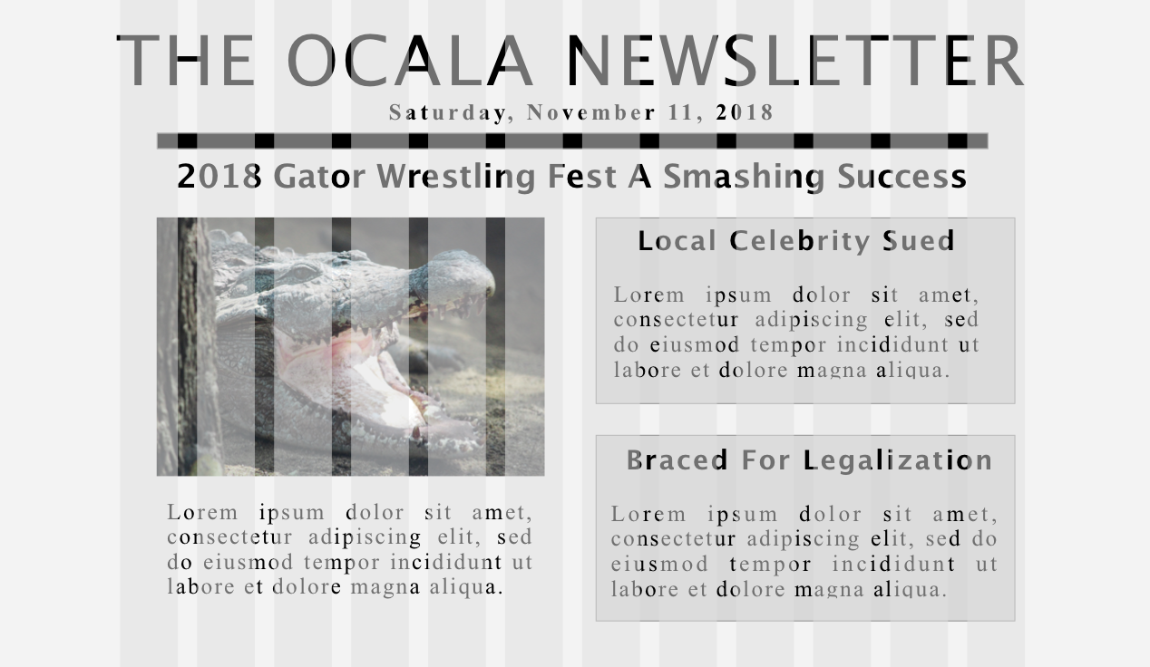
The Designer: Here’s the desktop version of the page. This should work for both desktop and tablet. I used a standard 12-column grid. I left the grid overlay on the document for you.

Engineering Manager: OK, so we haven’t built the API application the data is going to actually come from yet, so we just used lorem ipsum placeholder text so we could proceed with the front-end. Eventually, we will be pulling data from an API, but you don’t need to worry about that today. We just want you to start skinning the front-end.
The Designer: Right. So all the headline text is "Lucida Grande"; everything else is just "Times New Roman". The background color for the whole page is #F3F3F3. The boxes on the right-hand side of the page have backgrounds of #D8D8D8.
You: Understood.
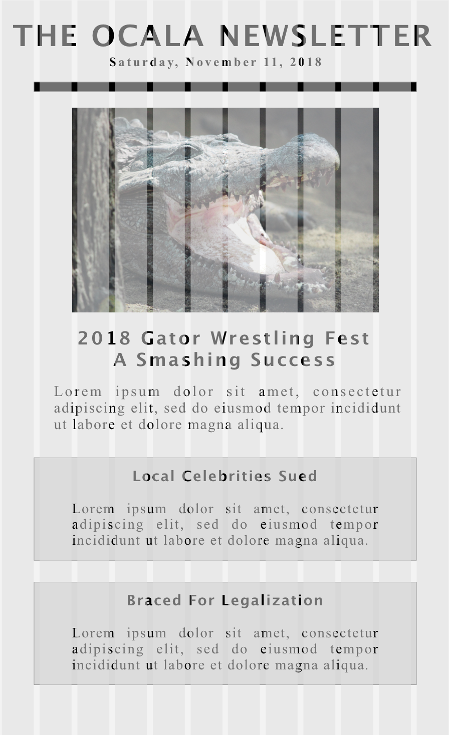
The Designer: Here’s the mobile site.

You: Looks good.
Engineering Manager: Don’t build two different pages. Just make one HTML document and one CSS stylesheet.
You: OK, so are we doing mobile-first or desktop-first?
The Designer: Desktop/tablet. They held a focus group of their readers and think that people will mostly read it on tablet.
You: Got a breakpoint you want me to use?
The Designer: Yeah, use iPad portrait pixel width.
You: Got it. I’ll send you a link to a GitHub Page by the end of the day.
The Plan
We will use our standard workflow and deploy with GitHub Pages.
We need to figure out how to make a webpage display the same content in two different ways, depending on the width of the user’s browser. We will begin by creating box diagrams for both mockups, paying special attention to containers, rows, and columns. Finding similarities between them will help us determine the structure of our HTML (remember: write HTML that makes writing CSS easy). After that, we will pick a layout strategy for this project.
Drawing Our Boxes
Let’s break the mockups into logical boxes, thinking carefully about which boxes should contain others.


Finding Similarities and Differences Between Mockups.
The main unit of content in a newspaper is the story. There are three stories in these mockups - the top story of the day and two regular stories. The top story gets an image and the top headline of the day in both mockups. The regular stories are in boxes that have the same styling. In both mockups, the regular stories stack vertically on top of each other.
There are two big differences between the mobile and desktop mockups. First, the headline placement for the top story goes in two different places in the flow of the document. This is easily solvable: We will insert the headline element into two places in the document, and toggle display:block and display:none on them, depending on viewport size.
The second difference lay in how the two columns which contain the top story and the regular stories are positioned relative to one another. In the Desktop mockup, these two big columns each make up one-half of the page and sit inline to one another. In the Mobile mockup, all of these stories have linebreaks after them. Essentially, we need the big story and regular stories boxes to sit inline unless the browser width is less than 768 pixels, in which case we want the second column to line up under the first, and for both of the big containers to (basically) take up the full width of the screen.
The CSS flexbox module shines in such circumstances.
Flexbox: Our Responsive Layout Solution
Flexbox is a relatively new CSS module, and it is fantastic. Most CSS grid libraries (more on this in the next chapter) use it, because it lets you do all kinds of crazy things with rows and columns.
At its core, flexbox is about the relationship between container elements and their (immediate) child elements. You set display: flex on the container element (usually a DIV), and then you can set a super handy flex property on its immediate children (often also DIVs). The flex value is a number that tells the browser how large the child elements should be in relation to one another.
For example, take the following HTML:
<div class="container">
    <div class="one">One</div>
    <div class="two">Two</div>
</div>
And the following CSS:
.container {
    display: flex;
}

.one {
    flex: 2;
}

.two {
    flex: 3;
}
In this situation, the DIV with a class of one would take up two-fifths of the width available in the container DIV. The DIV with a class of two would take up three-fifths.
You can also use the flex-display property on the container element to tell the browser whether the children elements should be arranged in a horizontal row (the default) or vertical column.
The Code
Project Setup
Nothing new here.
Git Plumbing
Nothing new here. Go set up a repo (with a README) called ocala-newsletter on GitHub.com, then clone it to your computer.
cd ~/Desktop
git clone https://github.com/<GITHUB-NAME>/ocala-newsletter
cd ocala-newsletter
File Structure
touch index.html styles.css
mkdir images
Obtaining assets
Go to the follow link, download gator.png, and add it to the images folder you just created:
https://github.com/kevmo/ocala-newsletter/tree/master/images
Write the HTML
Open the project in your text editor. Write the index.html page:
<!doctype html>
<html>

    <head>
        <meta charset="utf-8">

        <meta name="viewport" content="width=device-width, initial-scale=1, shrink-to-fit=no">

        <link rel="stylesheet" href="https://cdnjs.cloudflare.com/ajax/libs/normalize/8.0.0/normalize.css">
        <link rel="stylesheet" href="styles.css">

        <title>Ocala Newsletter</title>
    </head>

    <body>
        <div class="container">

            <h1>the ocala newsletter</h1>
            <p class="date">Saturday, November 11, 2018</p>

            <h2 class="mobile-hidden">2018 gator wrestling fest a smashing success</h2>

            <div class="row">

                <div class="top-story">
                    <img src="images/gator.png" alt="snarling alligator">
                    <h2 class="desktop-hidden">2018 gator wrestling fest a smashing success</h2>
                    <p>Lorem ipsum dolor sit amet, consectetur adipiscing elit, sed do eiusmod tempor incididunt ut labore et dolore magna aliqua. </p>
                </div>

                <div class="stories">
                    <div class="story">
                        <h3>Local Celebrity Sued</h3>
                        <p>Lorem ipsum dolor sit amet, consectetur adipiscing elit, sed do eiusmod tempor incididunt ut labore et dolore magna aliqua. </p>
                    </div>
                    <div class="story">
                        <h3>braced for legalization</h3>
                        <p>Lorem ipsum dolor sit amet, consectetur adipiscing elit, sed do eiusmod tempor incididunt ut labore et dolore magna aliqua. </p>
                    </div>
                </div>
            </div>
        </div>
    </body>
</html>
From the command line, save to git.
git status
git add index.html
git commit -m "First draft of index.html."
Write the CSS
Now for styles.css…
/* This stylesheet is "Desktop First" */

html {
    background: #F3F3F3;
}

body {
    text-align: center;
    box-sizing: border-box;
    font-family: "Times New Roman", serif;
}

.desktop-hidden {
    display: none;
}

.container {
    max-width: 1100px;
    margin: 0 auto;
}

.row,
.stories {
    display: flex;
}

.stories {
    flex-direction: column;
}

.row div,
.stories div {
    flex: 1;
}


p.date {
    border-bottom: 10px solid black;
    width: 95%;
    margin: 0 auto;
    padding-bottom: 1em;
    font-size: 1.5em;
    letter-spacing: 3px;
    font-weight: bold;

}

.top-story img,
.top-story p {
    width: 80%;
    margin: 0 auto;
}

.story {
    border: 1px solid black;
    background-color: #D8D8D8;
    margin: 0 3em 1.5em 3em;
    padding: 1em;
}

.story h3 {
    margin: 0;
}

h1,
h2,
h3 {
    font-family: "Lucida Grande", serif;
}

h1 {
    font-size: 3.5em;
    text-transform: uppercase;
    letter-spacing: 2px;
    font-weight: 500;
    letter-spacing: 3px;
    margin: 1em 0 .4em 0;
}

h2,
h3 {
    text-transform: capitalize;
}

/* Mobile Second */

@media (max-width: 768px) {

    .row {
        flex-direction: column;
    }

    .desktop-hidden {
        display: block;
    }

    .mobile-hidden {
        display: none;
    }

    h1 {
        letter-spacing: 0;
        font-size: 1.7em;
        font-weight: bold;

    }

    .top-story {
        margin: 1em 0;
    }
}
From the command line, save to git.
git status
git add index.html
git commit -m "First draft of index.html."
Test
Now it is time to test. Run your Python command.
python -m http.server
How does it look in the ol http://localhost:8000?
Iterate
If it doesn’t look so good, fix it. Debug it. Make sure you git add and git commit your work.
Deploy
Make sure your master branch is up to date with git status. Go ahead and push that master branch to the remote repo:
git push origin master
Now deploy with GitHub Pages:
git checkout -b gh-pages
git push origin gh-pages
Write the README
Switch back to the master branch for this:
git checkout master
Now, in the text editor, write your README in the Markdown language:
## Local testing

   From the root directory, run the following command:
        python -m http.server

   The page should now be available at `http:localhost:8000`


## Technologies used

    * HTML5
    * CSS Flexbox modul
    * Python for a local HTTP server
    * GitHub Pages for Deployment

## See it live!

    Navigate [here[](https://<YOUR-GITHUB-USERNAME>.github.io/ocala-newsletter) to see it live!
Recap
You just learned how to use the CSS Flexbox module to create a single document and stylesheet combination that works on both mobile, desktop, and iPad. This is a powerful skill that lets you do many cool thing. The ability to make responsive websites is highly coveted in all kinds of marketplaces.
Exercises
- Read the first half of Chapter 17 of the CSS Book, Modern Web Layout With Flexbox. Skim the second half.
Push one of the tutorials from this chapter as its own github repo/project/page, if you’re feeling adventurous.
-
If you apply
display:flexto an element, what does it do to that element’s immediate child elements? - How do you use the following CSS properties together?
displayflexflex-direction
- “Lorem ipsum” is what people call a chunk of commonly used placeholder text. It was originally written by Cicero, the Roman philosopher.

-
Go to http://www.caniuse.com (“Can I use?”). Is
display:flexsupported on enough browsers to no longer need browser prefixes? What do you think? -
Go to meetup.com and search for groups that talk about “responsive web design”.
-
Go add READMEs to every repository on your GitHub profile that does not have one.
If you need help writing “GitHub-flavored markdown”, see here: https://github.github.com/gfm/
- The Ocala Newsletter webpage is looking pretty bland. Why don’t you try jazzing it up with some cooler colors and fonts? Make sure to commit and push your changes!
